
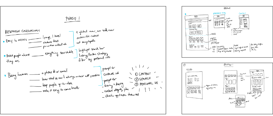
Every project will have its own design process, requirements, and constraints. But there are some general best practices that help almost any design be successful—especially when it comes to products intended for high usability.
User Experience Principles
1. Know your users
You’re not designing for just anyone, or for yourself — you’re designing for your specific user group(s). To do this, you need to identify your key audiences and investigate their needs, and base your design decisions around them.
2. Don’t make them think
The less a user has to think while using an interface, the more usable it is. Aim to design interactions requiring little thought.
3. Make it intuitive
An intuitive interface is one that makes sense. Actions that users expect are the ones that happen. Things are where they should be. Patterns and combinations are consistent. Of course, all people perceive interfaces differently, so testing is key.
4. Focus on function
Functionality refers to how well a site meets its intended function. When designing, keep the question “What’s this thing supposed to be doing?” top of mind. Make sure it’s always being served.
Design
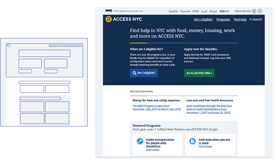
1. Use visual hierarchy
Design should call attention to what’s important. Good visual hierarchy in your interface will use things like scale and color to signify what the user shouldn’t miss.
2. Be consistent
Use consistent visual design elements, like color, fonts, and spacing, throughout your interface. This helps users become more familiar with your site more quickly, ultimately making for better usability.
3. Incorporate white space
Using white space in your design makes it less cluttered and easier to navigate. With less on the page, your users can focus on the content and find what they need more easily. White space is especially important for scanning and readability.